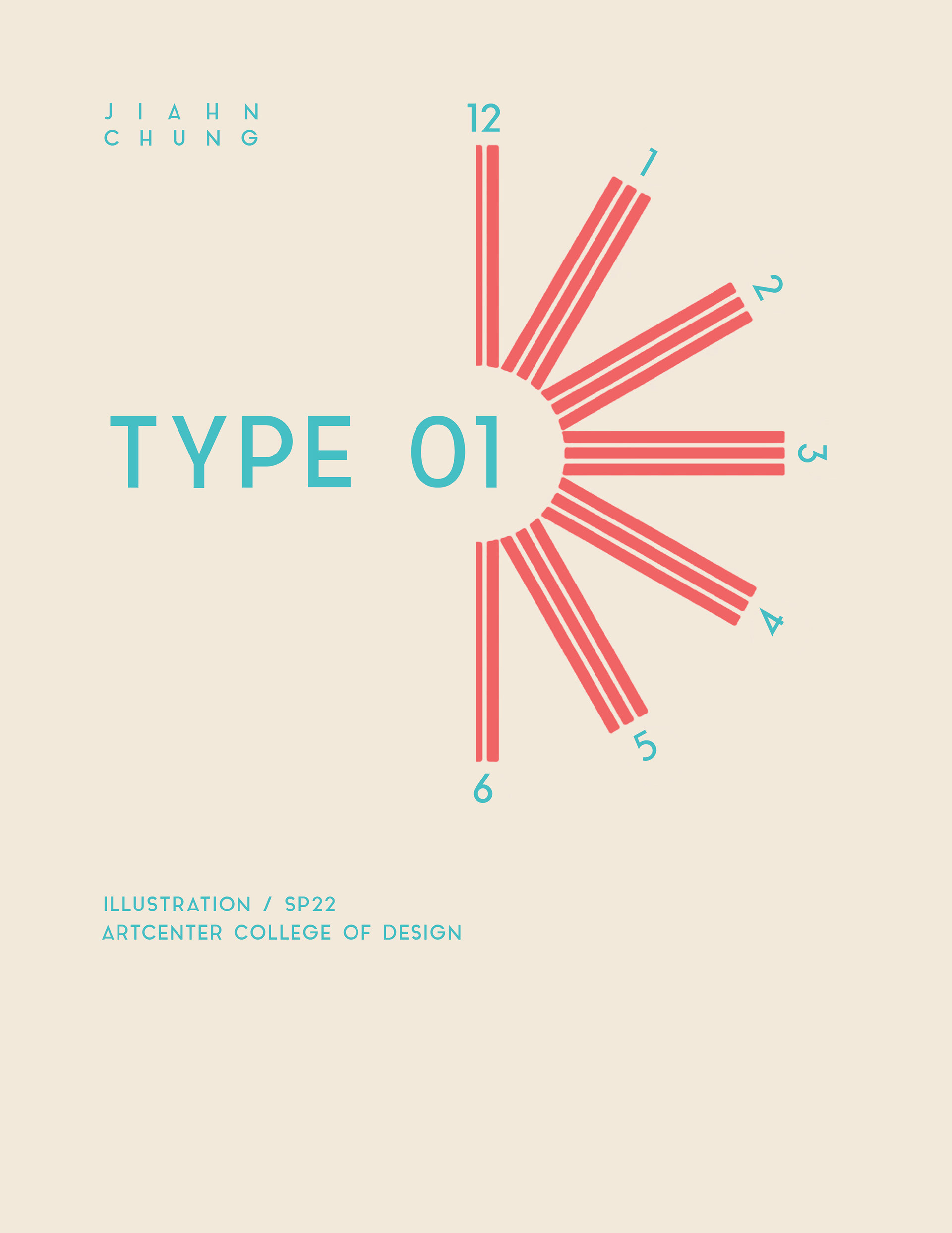
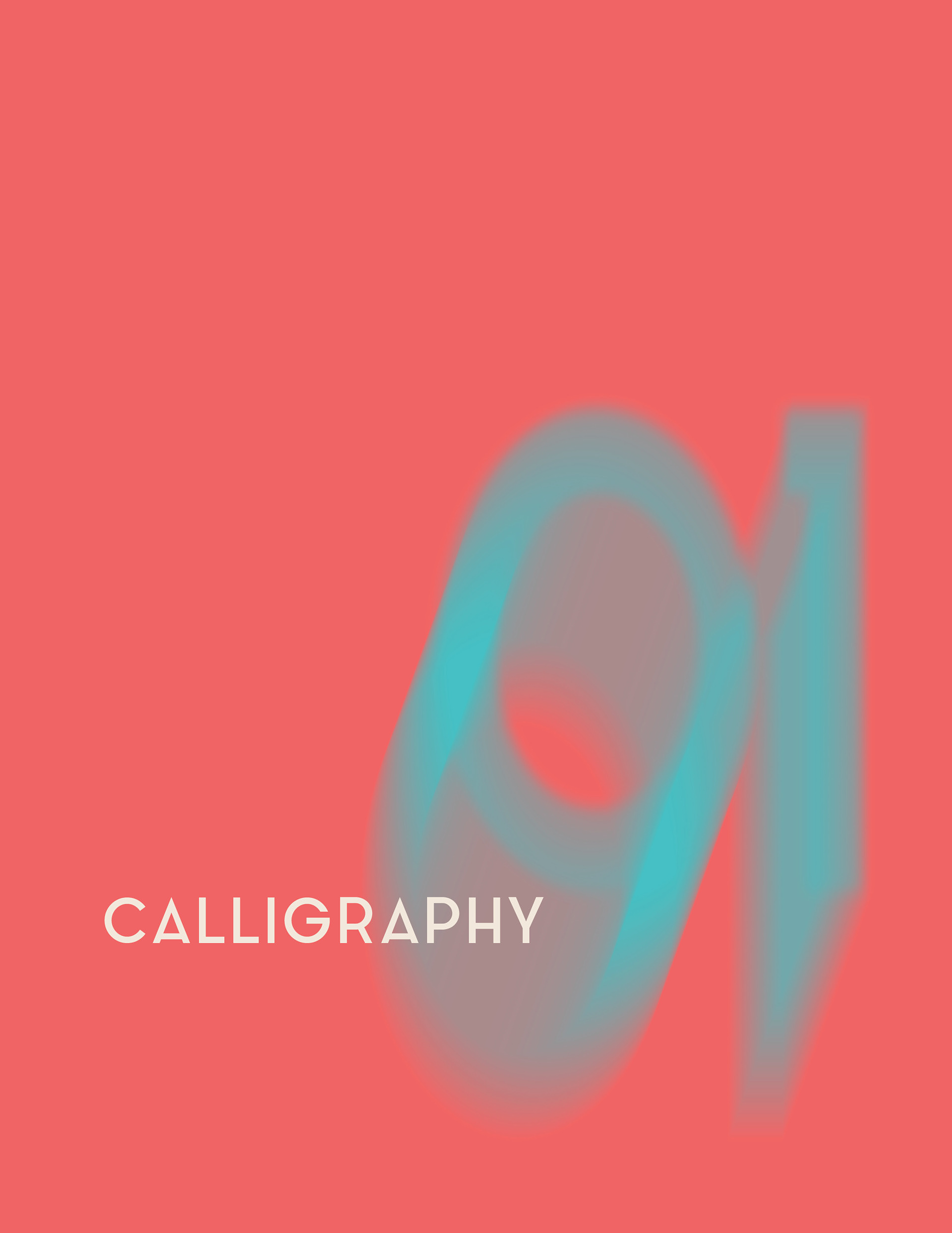
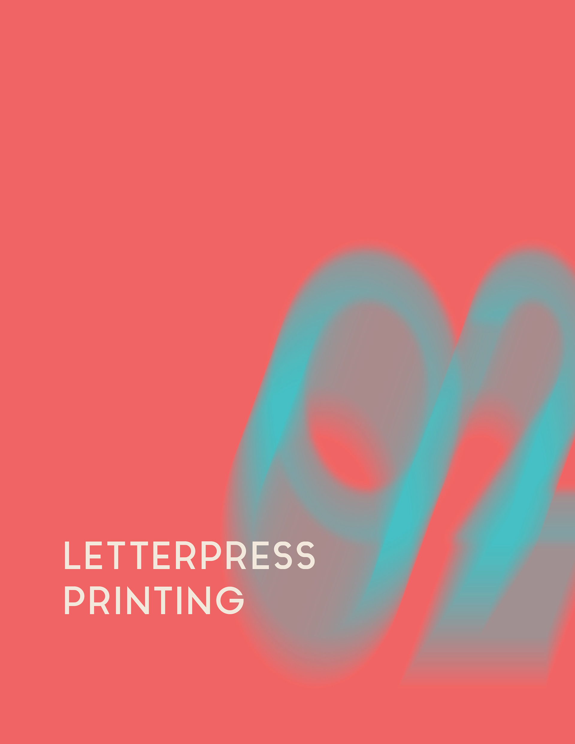
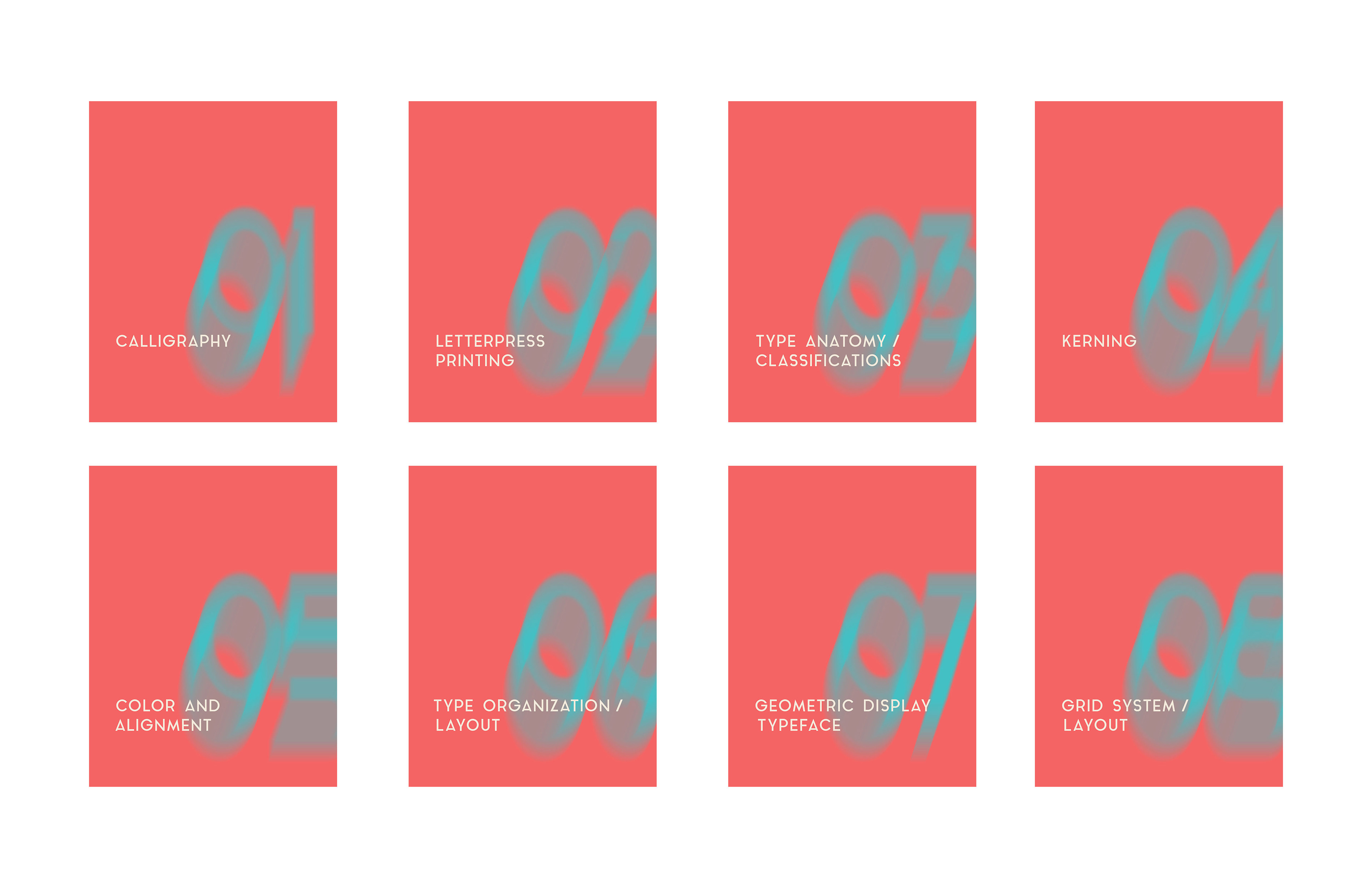
My design for the cover and dividers are based off astigmatism, which is something I have.
I used the influence of primary colors as well as it being part of Korea's culture too.
The grid I used was 2 golden ratios, the rule of thirds, and 3 circles laying on the middle lines.
I used the influence of primary colors as well as it being part of Korea's culture too.
The grid I used was 2 golden ratios, the rule of thirds, and 3 circles laying on the middle lines.
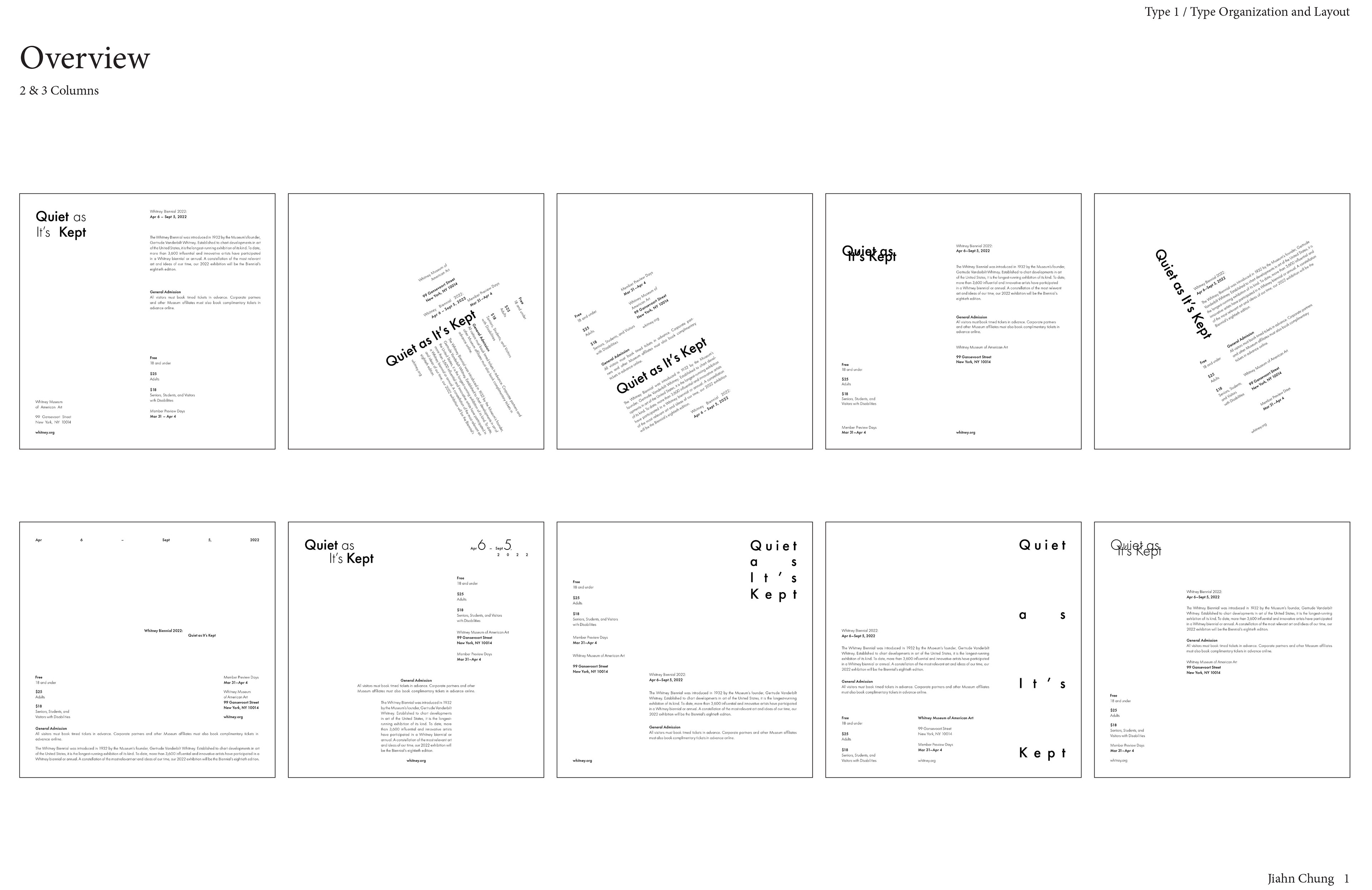
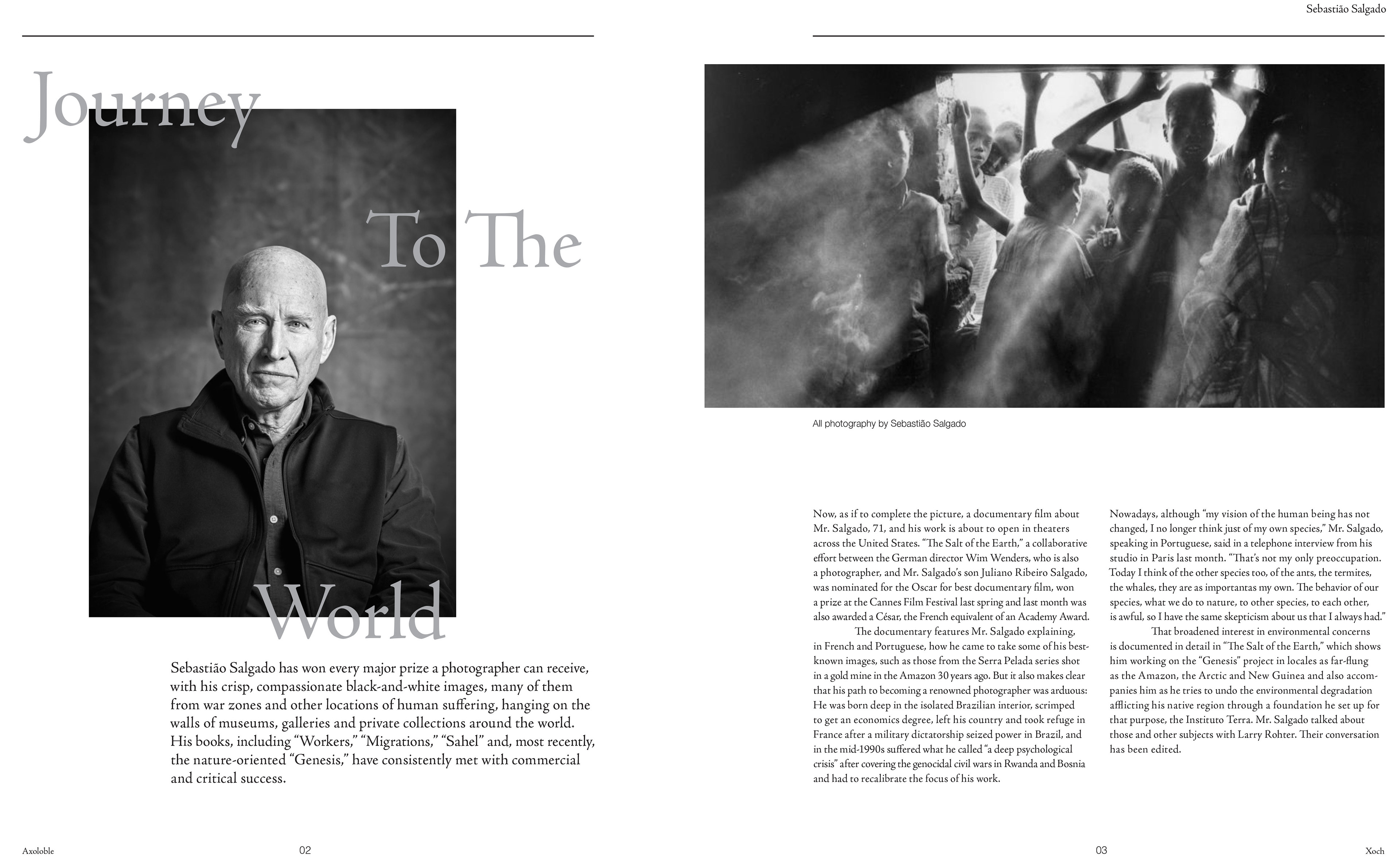
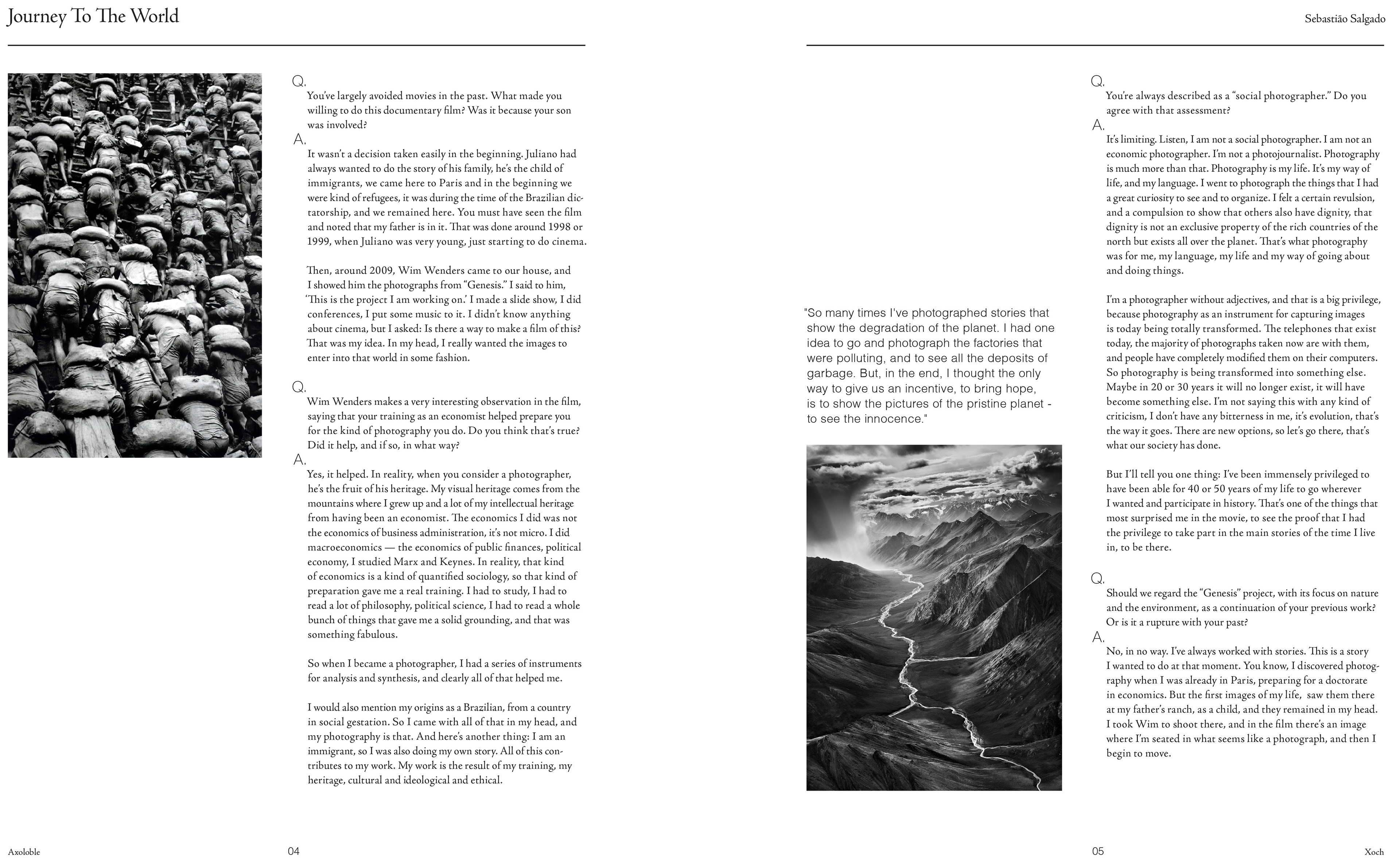
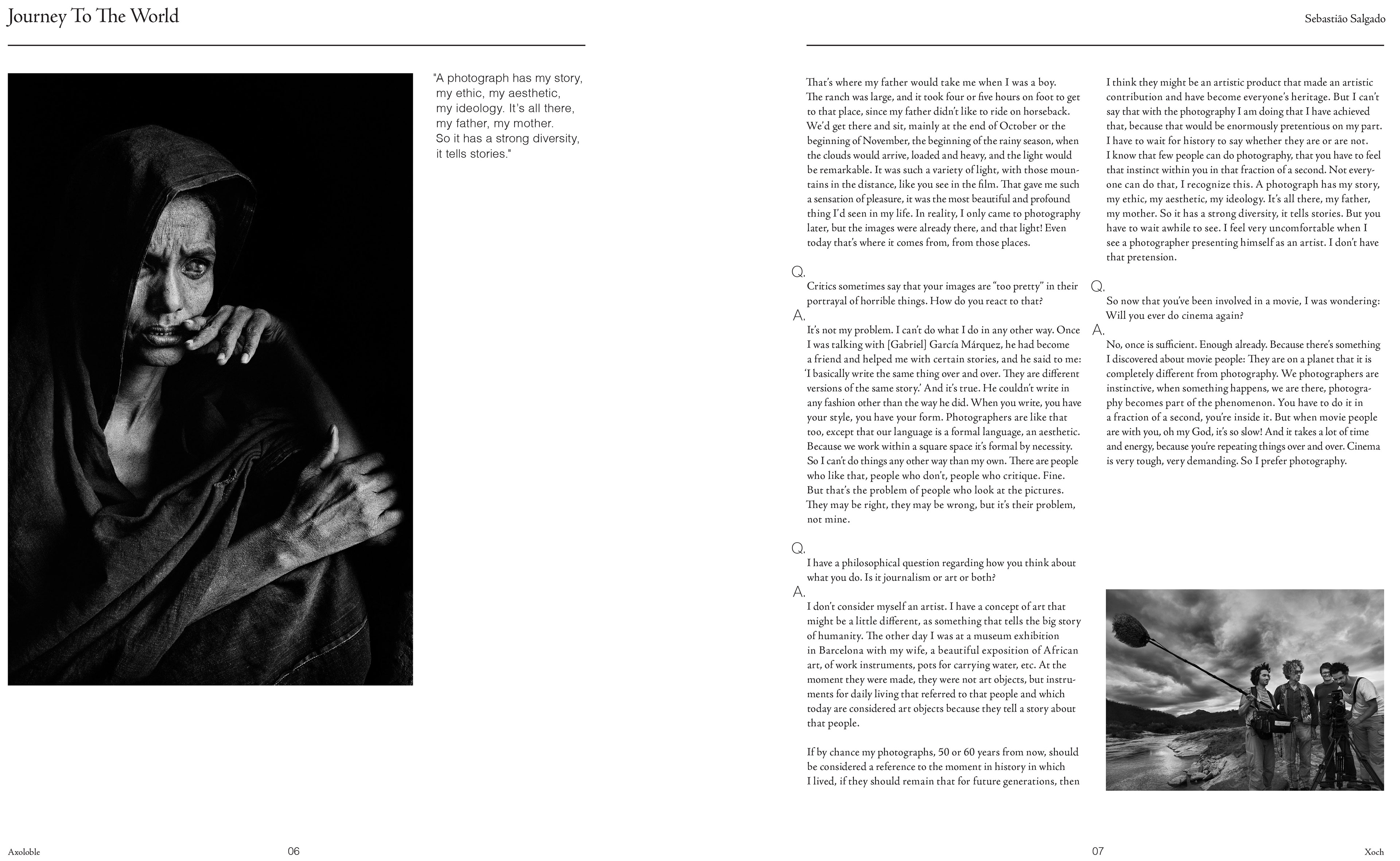
Magazine layout I designed for a given interview about Sebastião Salgado.
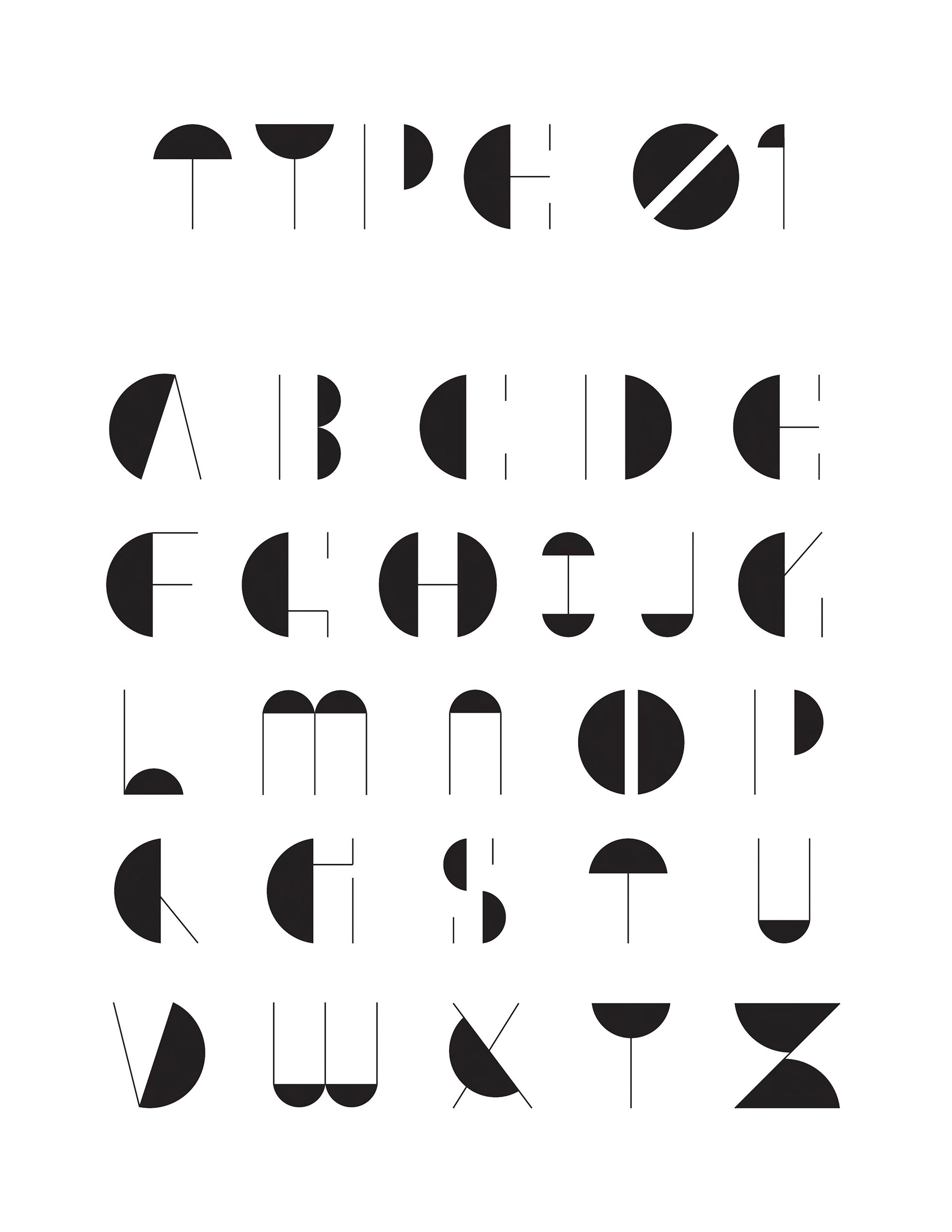
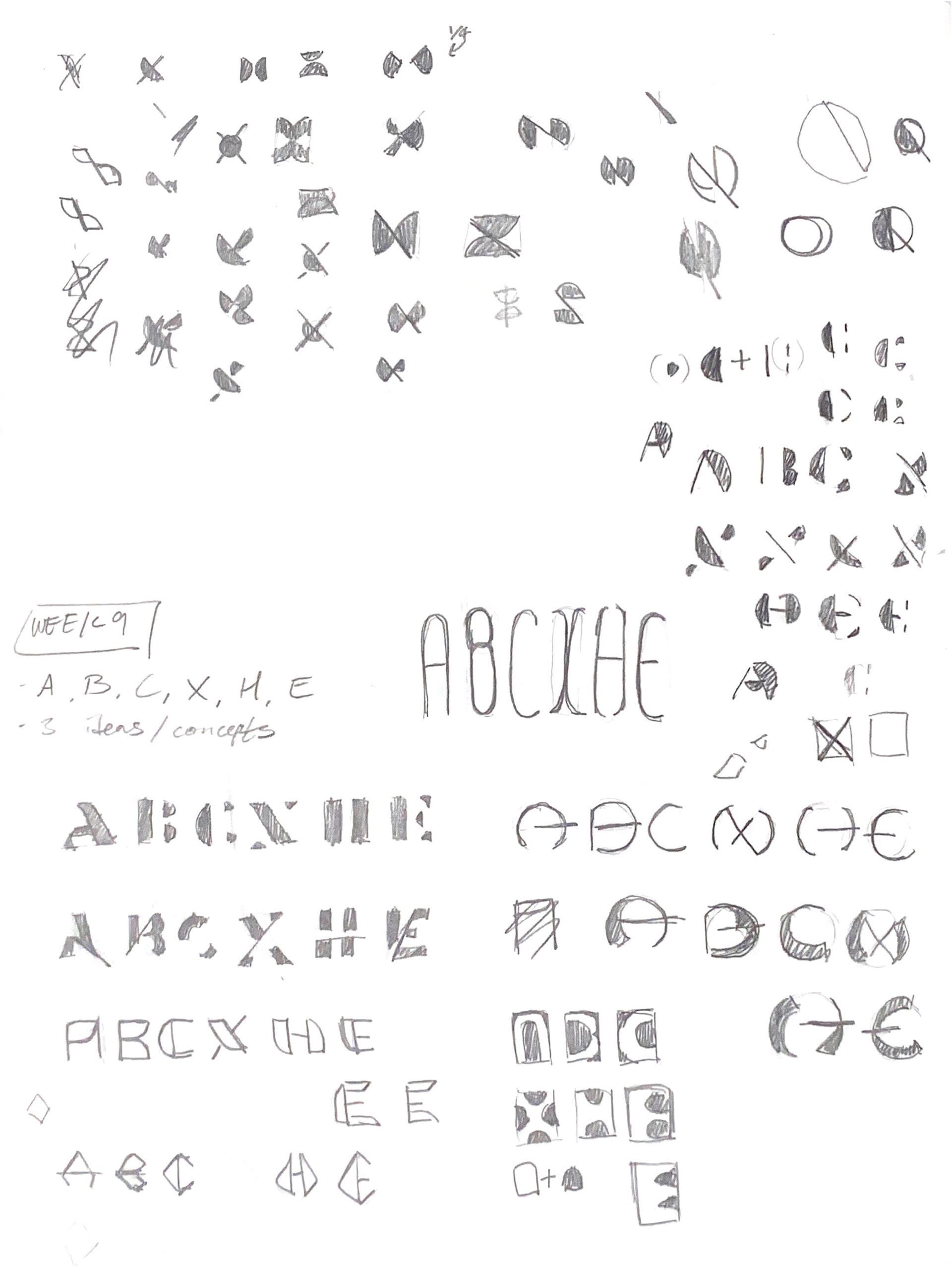
Typeface that I designed. A minimalist, geometric style.